How To Create a Highly Converting Landing Page

September 6, 2017
Generating leads and building brand awareness are crucial goals for many businesses today. To make a strong statement in the marketplace and create a positive first impression among potential customers, your landing page needs to have several key components to stand out from the crowd.
Everything from content to your user-experience needs to flawlessly portray both your message and brand. To help you out, we’ve put together essential components that every landing page needs to have.
Headlines & Content
One of the most important things you need to understand about creating an effective landing page is the need to make a strong first impression. Whether you’re driving users to your website through a PPC campaign, blog, social media post, or other method, chances are this is the first time they are visiting your website.
Headlines and associated content are one of the first things users view on your landing page. To make a strong first impression you need to deliver a clear and effective message to your audience. Headlines and content should be tailored around your product or service with your target market’s specific needs in mind.
For example, the headlines and content you would write for a landing page related to summer apparel would probably be different from content related to financial planning. To effectively communicate with your audience and increase their likelihood of conversion, your landing page should be able to answer these key questions for your audience:
What product/service am I offering?
What differentiates my offering? (Price, Customer Service, Quality, ect.)
How does it deliver value to my customer? (Saves money, saves time, ect.)
Forms
Many businesses design landing pages around having visitors complete forms to request more information or contact a member of a sales team. If your landing page includes a form that visitors are requested to fill out, you may want to follow these essential guidelines.
Short & Sweet:
To keep visitors engaged and increase the likelihood of conversions, your forms should only include the most necessary fields. According to Ubounce, forms with 3-5 data fields have around a 20% chance of conversion. Forms with more data fields tend to lose a significant portion of user traffic.
Based on your industry and the nature of your product/service, you need to tailor the forms on your website to your target audience. Asking for too much information or information that’s not relevant to your product/service can easily deter users from filling out the form.
Text Vs. Media
Designing the perfect landing page requires a delicate balance between text and supportive media. Like many website visitors, you probably feel a little overwhelmed when you visit a page that has paragraphs and paragraphs of continuous text. You probably find it easier to understand content when there are informational videos or images to support the topics outlined on the page.
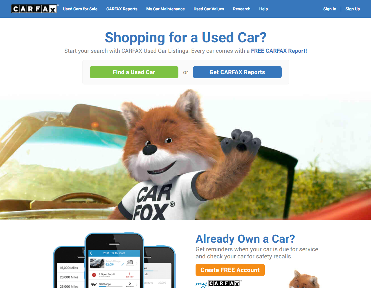
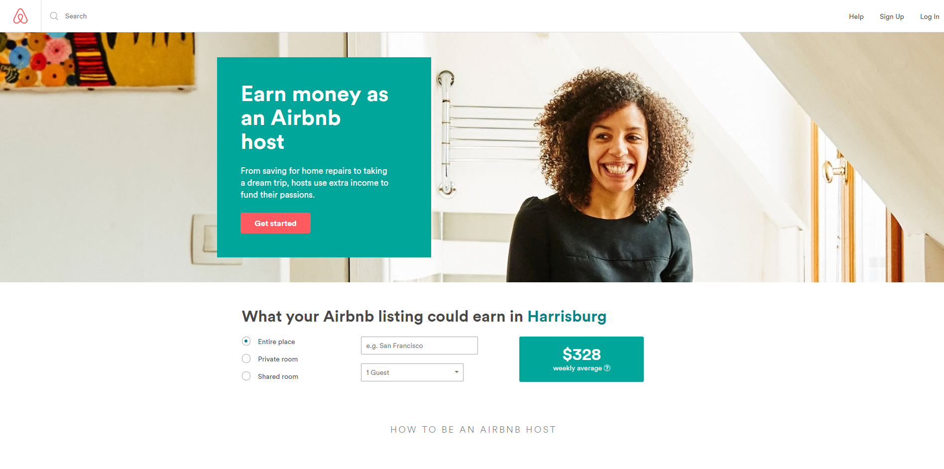
To help break down content throughout the page and provide a better user experience for your visitors, you need to have a good balance of text and other media. Including images related to your product/service or short informational videos are a great way to engage readers but also make content easier to read. Some great examples of companies with great landing pages are below:

Landing Page Speed & Responsiveness
A key to creating not only an effective landing page, but also a strong website, is ensuring prompt loading times and page responsiveness. According to a study by Kissmetrics, if a page takes longer than 3 seconds to load and display content, 40% of users will navigate away from the page. This means that the longer it takes your pages to load, the more likely you are to lose out on potential leads.
Another deterrent to conversions is page responsiveness. Users have the opportunity to view landing pages and online content across multiple devices. If your landing page isn’t responsive to different screen sizes, resolutions, and operating systems, you may be driving away both potential and current customers.
Simply put, if users have a hard time seeing the content on your page and have to zoom in or adjust their settings, they’re not likely to visit your page or website again. Responsiveness is key!
There are several free and paid tools you can use to improve the responsiveness and page speed of your landing page. One of the most popular tools for assessing the loading time of your webpages is Google’s PageSpeed. This free tool by Google provides detailed metrics on how your site is performing as well as areas where you can make improvements.
To get a better understanding of how your page looks across different devices, CSS Chopper provides a great tool that allows you to adjust for different screen sizes to simulate what your users see. With this tool you can navigate links, scroll through pages, and analyze what areas of your page need improvements.
Creating the perfect landing page is far from easy. Delivering a powerful message to a target audience and driving conversions takes careful planning an execution. In today’s crowded marketplace, you have a small window of opportunity to capture your audiences’ attention, deliver a message, and turn that attention into strong leads.
We work with businesses every day to help build and improve their digital presence. Do you feel like your website or landing page could be working harder for you? Think VIG!


