


Understanding Information Architecture

November 3, 2017
Have you ever heard the old phrase “putting the cart before the horse”?
 If you’re not familiar with this, it’s to suggest that something is done contrary to an ideal or expected order or relationship. It seems like a pretty basic lesson that we’ve all probably learned whether we’ve heard the phrase or not. More than likely, we’re going to continue to learn how true this phrase is in various stages of life until it truly sinks in.
Believe it or not, this is a phrase you’ll hear from our team quite often when we’re in client meetings discussing the beginning stages of a project; whether it’s a new website, a mobile application, marketing campaign, etc. You won’t hear us talk about this because we’re building chariots for horses, but because this phrase also applies to projects as well.
Over the years, we’ve replaced countless websites that looked great, but we’re more confusing to navigate than they truly needed to be. Content or pages were in areas of a site that didn’t make sense, an area your customer thought should be under a specific category or topic was no-where to be found, important content was buried on the site and by the time your potential customer found what they needed, they were on seven different pages of your website until they got frustrated and found your competitor’s website.
By the way, if we’re describing your website, don’t worry – there is a solution!
So how is this avoided?
 Well in a good discovery process, the company’s key stakeholders will be asked to sit down and review what they like about the current website or application. Questions will be bounced around like:
- Does the current website still describe the service offerings the company still provides?
- Do you get many leads from your current website?
- Do you know what the current traffic of the site looks like?
- Have you had any feedback on the site from customers?
- Do you get a lot of calls over the phone from potential customers saying, “I was on your website and I wasn’t sure of…”
The list could go on and on, but the goal is for our team at VIG to gain a good understanding of the hierarchy of your digital needs. What services or offerings are most important to your customers, why customers are even using your website in the first place, and what they should be found quickly (within two to three clicks) before they have left and are on your competitor’s website.
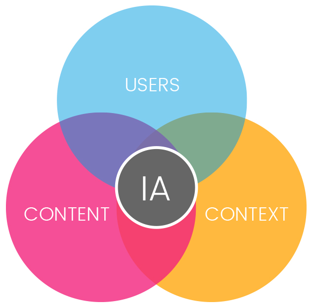
Here comes the keyword to all of this: Information Architecture.
Simply put, Information Architecture is the structure of all information in your website or application. It’s when we get a chance to work one on one with your team to put care into the arrangement of information you’re presenting to make it easier to understand and navigate.
Imagine being a writer that just sat down to write a book that never put together an outline before writing the story; it would be safe to assume it probably isn’t going to be very organized. What about building a house without an architect putting together the blueprint first, it just sounds like a terrible idea!
If you want a clean and focused design, you have to start with a clean and focused Information Architecture. It forces us to do the thinking so our users don’t have to!
An application or website is essence is simply a collection of information. Years ago, before websites were loaded with graphics and colors, that is really all they were. The practice of Information Architecture allows us to arrange and present this information (no matter how much will be there) in a way that is easy to understand and can continue to be scaled as the business grows. When you have a solid foundation, you can continue to build.
Starting to get concerned your website might be turning visitors or potential customers away? It’s alright, it’s not too late to fix it.
Here Are 5 Best Practices for a Good Website Information Architecture:
1) Be very clear about what’s important (and what isn’t).
Trust us, we know that our clients think all their services or offerings hold the same importance as another, but what really drives the business.
Overloading a visitor with too much information can easily push them away, so be sure to minimize content where you can afford too. You want to make sure that the site or application has a clear purpose, whether that is to sell a product, inform people on a subject, provide entertainment, etc.
So K.I.S.S. (keep it simple, stupid).
2) Think in terms of “buckets” of information.

Over the years, we’ve built some BIG websites and applications, 100’s even 1000’s of pages and screens. With sites or applications so large, without a good Information Architecture in place, users would be so confused. It is always very important to determine which items belong together and keep it consistent.
Think about your social media accounts. When you want to adjust your profile settings, everything related to your specific user account or settings is all in the same area; not scattered throughout.
When you’re looking for resources on a website (whitepapers, warranty, literature, etc.), you don’t want to be visiting 4 different sections on the website; it all makes sense to be in the same bucket.
3) Understanding your audience & define their goals.
This is a personal favorite of ours. Ever visit a website that was a topic or service extremely relevant to you but the website was just too over-the-top or hard to use? It happens more than you would think.
So, define your demographic of who will be using the website and create some personas. Developing various personas is a great way to define the types of users that will be using your website in different manners to achieve a goal or find information in different ways.
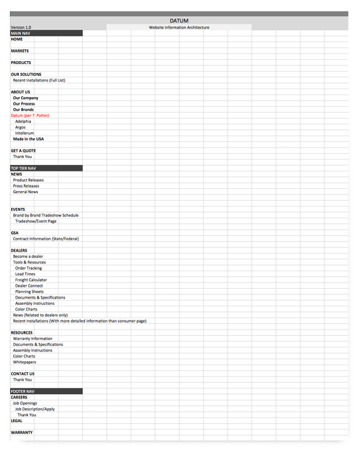
4) Wireframes.
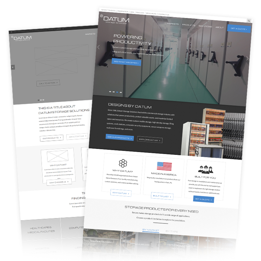 If the agency you’re working with doesn’t use the word “wireframing” when you’re building a new website or application and goes straight to the word “develop” or “design”; run!
Remember we mentioned about the author or builder just jumping into a project without the outline or blueprint? Imagine the revision fees you’re going to get hit with when you get a completed website with items in areas that don’t make sense.
Wireframes are the simple gray boxes and simple graphics that show you how a user will flow through your website. It allows a content strategist to see a general idea of how much content is going to be needed and allows your company to see how your content is going to be presented.
It might not be the whole website you’re going to see, but should be enough key screens that you’ll know if you’re headed in the right direction!
5) Don’t be afraid to revisit your Information Architecture
Ever wonder why Facebook continues to change the interface or different elements of the application every few?
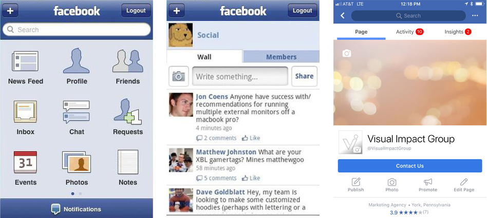
As much as it drives the audiences nuts, the audience is ever-evolving and changing as well. They aren’t offering services per say, but they are offering features. If they kept the app where it was years ago, even after a large uproar in the interface changes from their audience, a competitor when of come out with an easier to use application or network with more features while Facebook lost market share (i.e. Myspace).
So, let’s hear the old saying one more time, “don’t put the cart before the horse”.
Don’t build your house without developing a blueprint, don’t sit down to write a book without an outline, and for today’s lesson – don’t have your website built without determining who is using it and how you can get them to complete a goal without having to think.
If you’re starting to think that your website or application might be turning visitors to your competitor’s website, maybe it’s time we get together!